
1. flex-basis
flex-basis 指定了 flex 元素在主轴方向上的初始大小,如在 flex-direction: row 上描述的是其宽度,在 flex-direction: column 上描述的是其高度。
语法:
1 | /* 指定<'width'> */ |
宽度表现
当 flex-basis 的值大于元素在父级元素中的可占用空间,那么元素会被压缩,只占用可用的剩余空间(容器宽度 300px,flex-basis: 500px,实际占用 170px):

当元素内容宽度超出 flex-basis 设定的值时,元素宽度会无视设定值并拉伸元素,同时也会无视父级容器元素的宽度,超出父级容器限制:
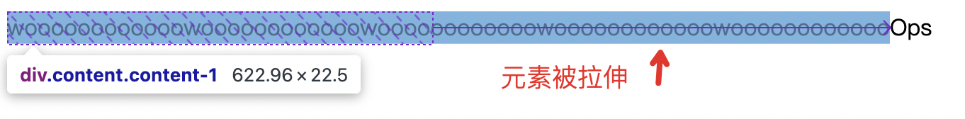
元素的实际宽度值计算:最大最小尺寸限制(min-width/max-width) > 弹性增长或收缩(flex-grow/flex-shrink) > 基础尺寸(flex-basis/width)
与 width height 的区别
谁主沉浮?
在 flex 布局中,元素的宽高与 width height 并无直接的关系,而是有 flex-basis 来决定的,当同时使用 width 和 flex-basis 时,前者不生效:
1 | .content { |
之所以我们平常使用 width height 来设定 flex 元素可以生效,那是因为 flex-basis 元素的默认值为 auto,在此时元素的空间计算取决于以下几点:
box-sizing盒模型;width/min-width/max-width等CSS属性设置;content内容(min-content最小宽度);
在什么情况下 width 和 flex-basis 的表现不一样?
当元素的内容宽度超过 width 和 flex-basis 的设定值时,两者的表现不一致。如果我们设定了绝对宽度,当元素内容超出宽度时内容会溢出,而当使用 flex-basis 时元素内容会将元素本身撑开。
比如,在下面的例子中,容器宽度为 200px,蓝色元素的内容宽度很显然已经超过 100px:
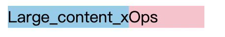
当我们在蓝色元素上添加 width: 100px 时,其表现为:
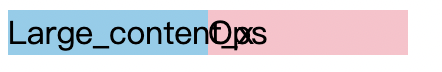
当我们在蓝色元素上添加 flex-basis: 100px 时,其表现为:

但是在这种情况下,flex-basis 与 width 的优先级发生了变化,当同时设定两者时表现与只设定 width 一致(Firefox 向 Safari、Chrome 对其)。
flex-basis 的关键字属性值
不常用,简单看一下表现。
min-content 表现:

max-content 表现:

2. flex-grow
用于设置 flex 项 主尺寸 的 flex 增长系数。