教程参考:https://www.bilibili.com/video/av66220144
1. 快速入门
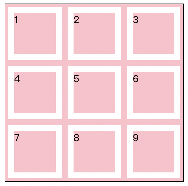
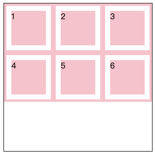
Grid 栅格布局类似于表格布局,可以快速将页面分割为多个部分,再在每个部分中去进行更为详细的布局。
创建一个快速栅格布局的实例:
1
2
3
4
5
6
7
8
9
10
11
| <div class="wrapper">
<div>1</div>
<div>2</div>
<div>3</div>
<div>4</div>
<div>5</div>
<div>6</div>
<div>7</div>
<div>8</div>
<div>9</div>
</div>
|
1
2
3
4
5
6
7
8
9
10
11
12
13
14
15
16
| .wrapper {
width: 250px;
height: 250px;
border: 1px solid #000000;
display: grid;
grid-template-rows: repeat(3, 1fr);
grid-template-columns: repeat(3, 1fr);
}
.wrapper>div {
background-color: pink;
padding: 10px;
background-clip: content-box;
border: 5px solid pink;
}
|
实现效果:
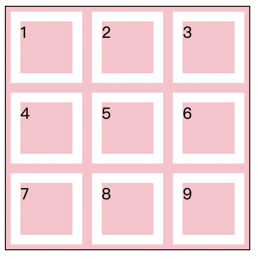
上述示例中我们将 grid-template-row 与 grid-template-columns 的值采用了简写的方式设为了平分为三等分,同时还可以,使用 px、百分比等作为单位,如:
1
2
3
4
5
6
7
8
9
| .wrapper {
width: 250px;
height: 250px;
border: 1px solid #000000;
display: grid;
grid-template-rows: 100px 100px 100px;
grid-template-columns: 100px 100px 100px;
}
|
你可以使用固定的轨道尺寸创建网格,比如使用像素单位。你也可以使用比如百分比或者专门为此目的创建的新单位 fr来创建有弹性尺寸的网格。 -MDN
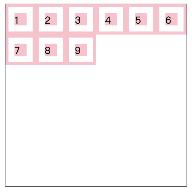
未定义行高或者列高,元素宽度会根据 grid 进行拉伸,但是高度为默认:
1
2
3
4
5
6
7
| .wrapper {
border: 1px solid #000000;
display: grid;
grid-template-rows: 100px;
grid-template-columns: 100px 100px;
}
|
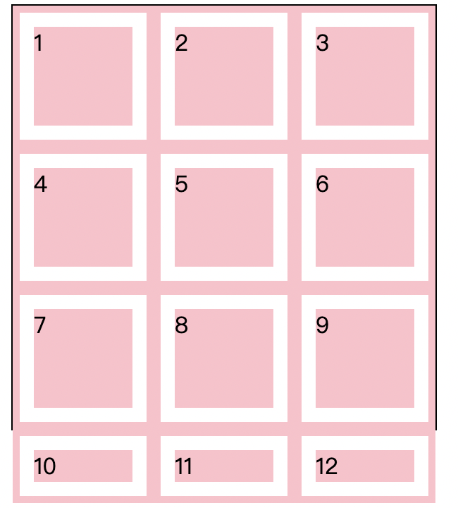
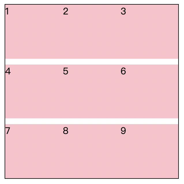
2. 重复 repeat
repeat 是 Grid 布局引入的一个新特性,可以将某一数值重复多遍。在上面的例子中 grid-template-rows: repeat(3, 1fr); 就相当于 grid-templete-rows: 1fr 1fr 1fr;。同时,repeat 还能重复多个值,如 grid-template-rows: repeat(3, 100px 50px); 就相当于 grid-template-rows: 100px 50px 100px 50px 100px 50px;
示例:
1
2
3
4
5
6
7
8
9
| <div class="wrapper">
<div>1</div>
<div>2</div>
<div>3</div>
<div>25</div>
<div>26</div>
<div>27</div>
</div>
|
1
2
3
4
5
6
7
8
9
10
11
12
13
14
| .wrapper {
width: 250px;
border: 1px solid #000000;
display: grid;
grid-template-rows: repeat(3, 50px 100px);
grid-template-columns: repeat(3, 1fr);
}
.wrapper>div {
background-color: pink;
padding: 10px;
background-clip: content-box;
border: 5px solid pink;
}
|
效果:
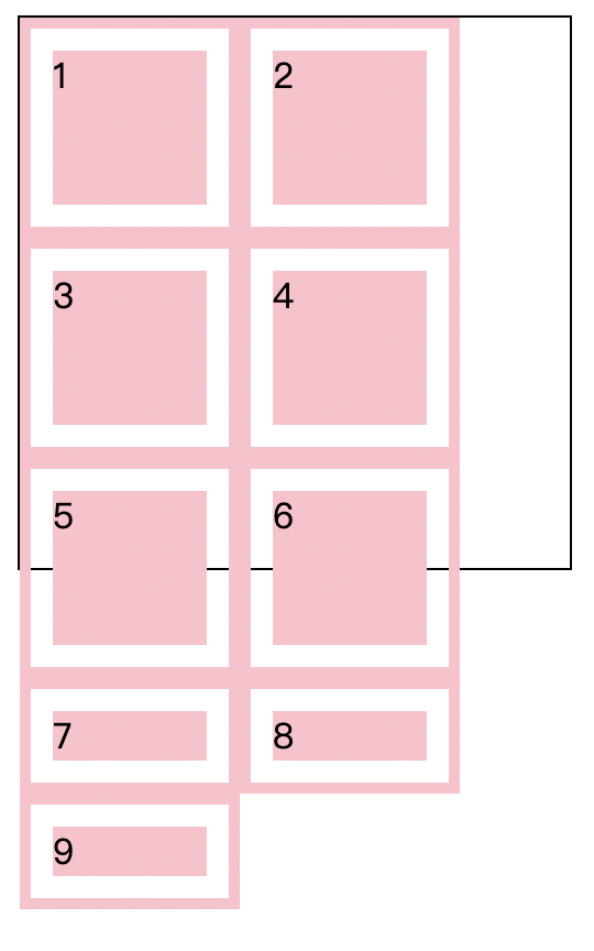
2. 自动填充 repeat auto-fill
Grid 中引入了自动填充的特性,在设置容器的行高与列宽时,使用 repeat() 第一个参数如果传入 auto-fill 第二个参数填入一定的数值,那么回自动拿着这个数值重复 n 遍,以填满整个栅格容器。
例1:
1
2
3
4
5
6
7
8
| .wrapper {
width: 300px;
height: 300px;
border: 1px solid #000000;
display: grid;
grid-template-rows: repeat(auto-fill, 100px);
grid-template-columns: repeat(auto-fill, 100px);
}
|
例2:
1
2
3
4
5
6
7
8
| .wrapper {
width: 300px;
height: 300px;
border: 1px solid #000000;
display: grid;
grid-template-rows: repeat(auto-fill, 50px);
grid-template-columns: repeat(auto-fill, 50px);
}
|
例3:
测试溢出时的情况
1
2
3
4
5
6
7
8
| .wrapper {
width: 300px;
height: 300px;
border: 1px solid #000000;
display: grid;
grid-template-rows: repeat(auto-fill, 100px);
grid-template-columns: repeat(auto-fill, 100px);
}
|
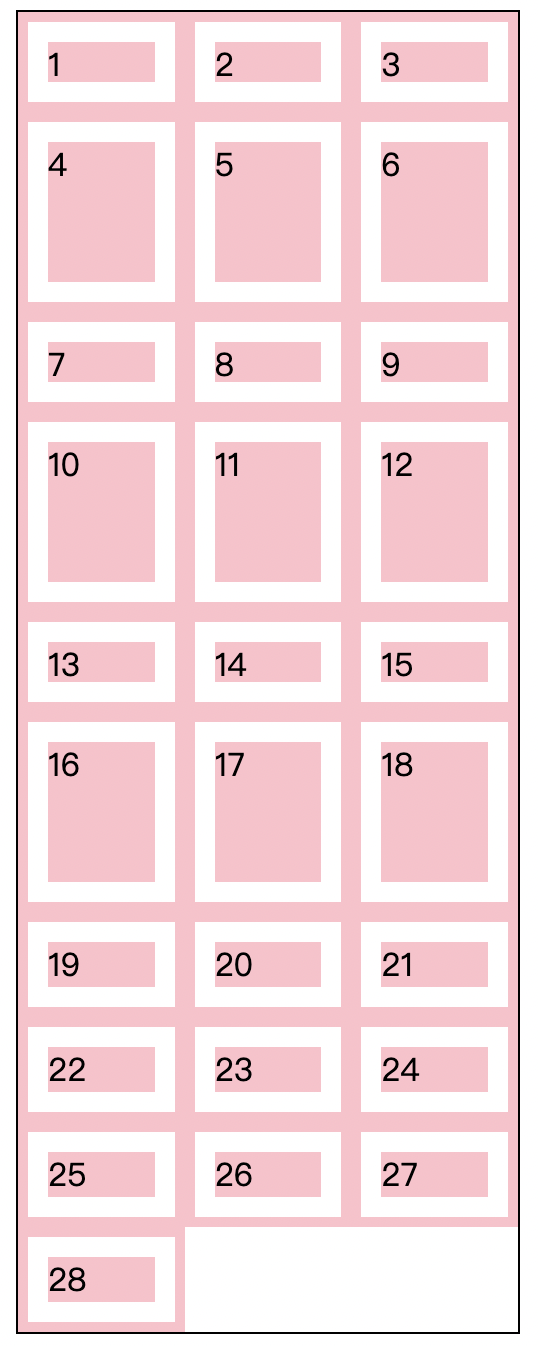
3. 取值范围 minmax
在设置行高与宽高时,还可以通过 minmax 来设置值的取值范围。
例1:
1
2
3
4
5
6
7
8
| .wrapper {
width: 300px;
height: 200px;
border: 1px solid #000000;
display: grid;
grid-template-rows: repeat(3, minmax(50px, 100px));
grid-template-columns: repeat(auto-fill, 100px);
}
|
例2:
1
2
3
4
5
6
7
8
| .wrapper {
width: 300px;
height: 200px;
border: 1px solid #000000;
display: grid;
grid-template-rows: repeat(2, minmax(50px, 100px));
grid-template-columns: repeat(auto-fill, 100px);
}
|
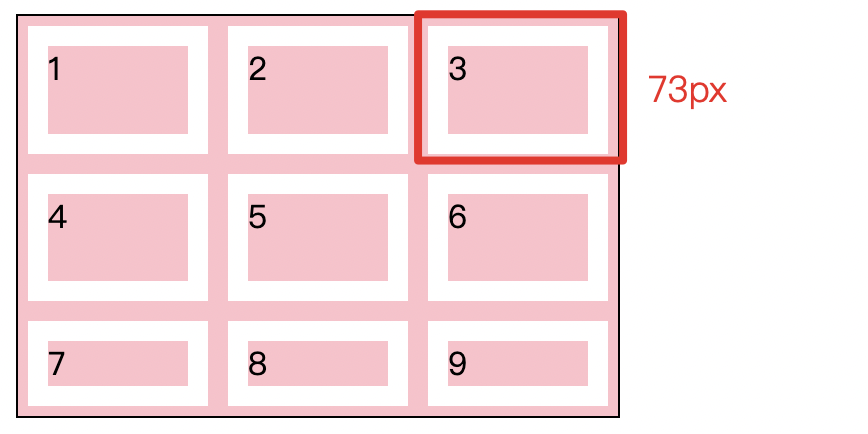
为了不让第三行元素溢出,前两行元素的高度自动设定为 73px
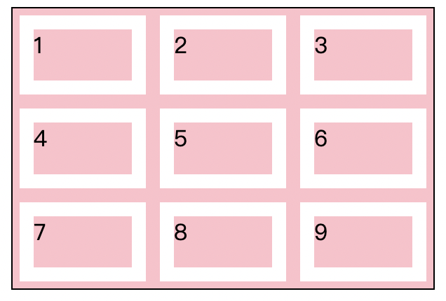
4. 间距 gap
使用 row-gap 可以设置行间距,设置 column-gap 可以设置列间距
例1,row-gap:
1
2
3
4
5
6
7
8
9
10
11
| <div class="wrapper">
<div>1</div>
<div>2</div>
<div>3</div>
<div>4</div>
<div>5</div>
<div>6</div>
<div>7</div>
<div>8</div>
<div>9</div>
</div>
|
1
2
3
4
5
6
7
8
9
10
11
12
13
| .wrapper {
width: 300px;
height: 300px;
border: 1px solid #000000;
display: grid;
grid-template-rows: repeat(3, 1fr);
grid-template-columns: repeat(3, 1fr);
row-gap: 10px;
}
.wrapper>div {
background-color: pink;
}
|
例2,column-gap:
1
2
3
4
5
6
7
8
9
| .wrapper {
width: 300px;
height: 300px;
border: 1px solid #000000;
display: grid;
grid-template-rows: repeat(3, 1fr);
grid-template-columns: repeat(3, 1fr);
column-gap: 10px;
}
|
可以使用复合样式:gap: [行间距] [列间距]
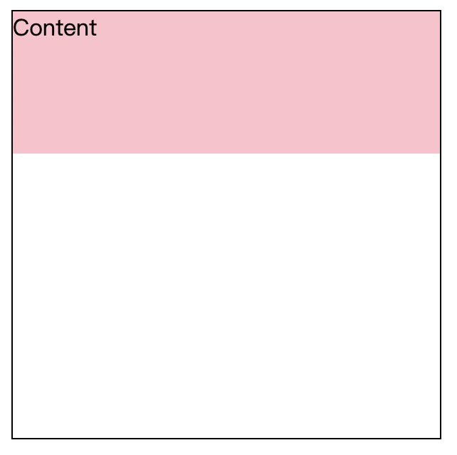
5. 定位 grid-row grid-column
在栅格化布局中,元素最外层的 div 容器负责划分区域,那么元素内层的 div 就为实体内容,我们可以根据划分好的网格将元素定位至网格的任意位置。
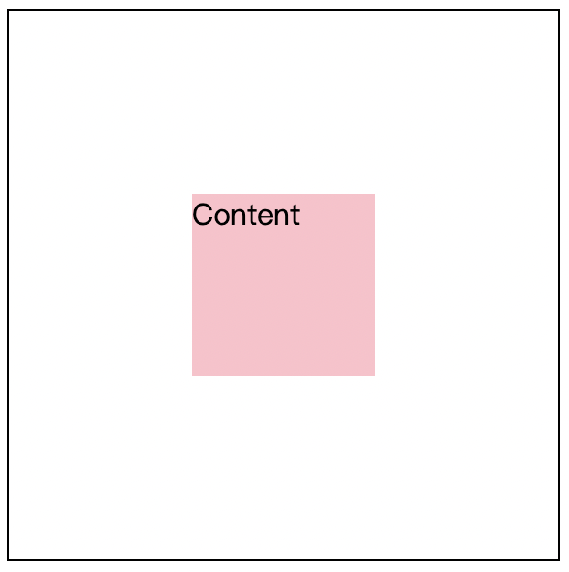
任意一个实体元素都必须为矩形,因此会拥有四条边,我们的定位依据就是由这四条边来决定的。一个实体元素的上边被称为 grid-row-start,下边被称为 grid-row-end,左边被称为 grid-column-start,右边被称为 grid-column-end。

当我们想要将其对其到某个位置时,只需要注明每条边对应到栅格的哪一条边即可,如:
1
2
3
| <div class="wrapper">
<div>Content</div>
</div>
|
1
2
3
4
5
6
7
8
9
10
11
12
13
14
15
16
| .wrapper {
width: 300px;
height: 300px;
border: 1px solid #000000;
display: grid;
grid-template-rows: repeat(3, 1fr);
grid-template-columns: repeat(3, 1fr);
}
.wrapper>div {
background-color: pink;
grid-row-start: 1;
grid-row-end: 2;
grid-column-start: 1;
grid-column-end: 4;
}
|
效果:
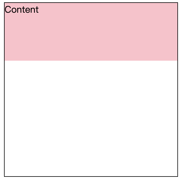
1
2
3
4
5
6
7
8
9
10
11
12
13
14
15
16
| .wrapper {
width: 300px;
height: 300px;
border: 1px solid #000000;
display: grid;
grid-template-rows: repeat(3, 1fr);
grid-template-columns: repeat(3, 1fr);
}
.wrapper > div {
background-color: pink;
grid-row-start: 2;
grid-row-end: 3;
grid-column-start: 2;
grid-column-end: 3;
}
|
效果:
此外布局的定位还可以使用分隔符 / 简写,分隔符的前后分别代表起始边与结束边,如上面的定位可以改写为:
1
2
3
4
5
| .wrapper>div {
background-color: pink;
grid-row: 1 / 2;
grid-column: 1 / 4;
}
|
6. 布局命名
在定义网格时,把网格线的名字写在方括号内,名字随意。我们先为容器的起点和终点命名,既包括行的,也包括列的。接下来再把处于网格中间的块的起点和终点命名为 c-start 和 c-end,也是包括行和列的。不一定要把全部网格线都命名,只需要为布局时用到的关键线命名即可。
1
2
3
4
5
6
7
8
9
10
11
12
13
14
15
16
| .wrapper {
width: 300px;
height: 300px;
border: 1px solid #000000;
display: grid;
grid-template-rows: [r1-start] 100px [r1-end r2-start] 100px [r2-end r3-start] 100px [r3-end];
grid-template-columns: [c1-start] 100px [c1-end c2-start] 100px [c2-end c3-start] 100px [c3-end];
}
.wrapper>div {
background-color: pink;
grid-row-start: r1-start;
grid-row-end: r1-end;
grid-column-start: c1-start;
grid-column-end: c3-end;
}
|
如果我们使用了 repeat 来创建边,那命名的方式稍有区别,在命名后使用该边时,要后缀时那一行或者哪一列的边:
1
2
3
4
5
6
7
8
9
10
11
12
13
14
15
16
| .wrapper {
width: 300px;
height: 300px;
border: 1px solid #000000;
display: grid;
grid-template-rows: repeat(3, [r-start] 1fr [r-end]);
grid-template-columns: repeat(3, [c-start] 1fr [c-end]);
}
.wrapper>div {
background-color: pink;
grid-row-start: r-start 1;
grid-row-end: r-end 1;
grid-column-start: c-start 1;
grid-column-end: c-end 3;
}
|
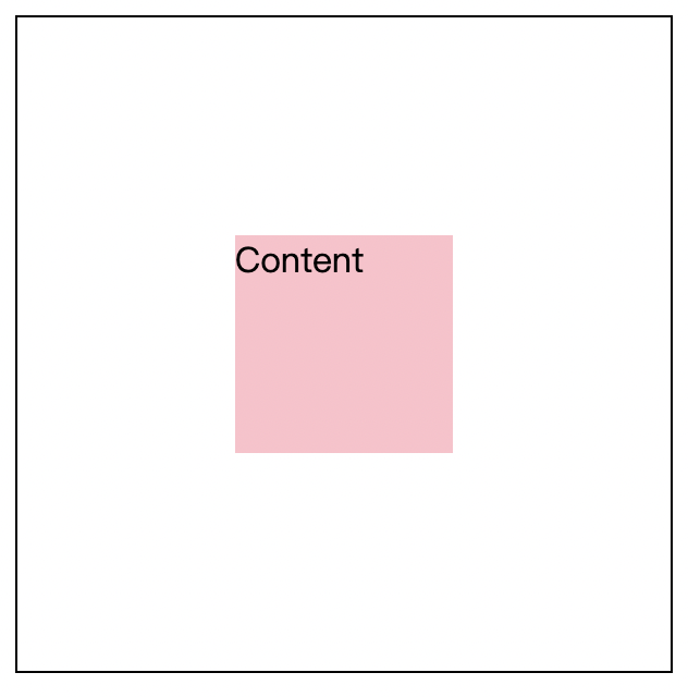
7. 偏移 span
在定位的过程中,如果确定了一条边之,可以使用 span 来对另一条边进行相对定位,如 span 1 代表着相对于上一条确定的边再偏移一条边。以下为具体示例:
1
2
3
4
5
6
7
8
9
10
11
12
13
14
15
16
| .wrapper {
width: 300px;
height: 300px;
border: 1px solid #000000;
display: grid;
grid-template-rows: repeat(3, 1fr);
grid-template-columns: repeat(3, 1fr);
}
.wrapper>div {
background-color: pink;
grid-row-start: 2;
grid-row-end: span 1;
grid-column-start: 2;
grid-column-end: span 1;
}
|
8. 区域定位 grid-area
除了使用 grid-row、grid-column 的定位方式之外,还可以使用 grid-area 区域定位的方式。区域定位分别代表上起始边、左起始边、下终边、右终边,其之间分别用 / 相间隔。
示例 1:
1
2
3
4
5
6
7
8
9
10
11
12
13
| .wrapper {
width: 300px;
height: 300px;
border: 1px solid #000000;
display: grid;
grid-template-rows: repeat(3, 1fr);
grid-template-columns: repeat(3, 1fr);
}
.wrapper>div {
background-color: pink;
grid-area: 1/1/2/4;
}
|

示例 2:
1
2
3
4
5
6
7
8
9
10
11
12
13
| .wrapper {
width: 300px;
height: 300px;
border: 1px solid #000000;
display: grid;
grid-template-rows: repeat(3, 1fr);
grid-template-columns: repeat(3, 1fr);
}
.wrapper>div {
background-color: pink;
grid-area: 1/2/3/4;
}
|

9. 区域命名 grid-template-areas
可以使用 grid-template-areas 为区域进行命名,每行之间用不同的字符串相间隔,每列之间用空格相隔。
例:
1
2
3
4
5
6
| <div class="container">
<header>Header</header>
<nav>Nav</nav>
<main>Main</main>
<footer>Footer</footer>
</div>
|
1
2
3
4
5
6
7
8
9
10
11
12
13
14
15
16
17
18
19
20
21
22
23
24
25
26
27
28
29
30
31
32
33
34
35
36
37
38
39
40
41
42
| * {
padding: 0;
margin: 0em;
}
.container {
width: 100vw;
height: 100vh;
display: grid;
grid-template-rows: 60px 1fr 60px;
grid-template-columns: 100px 1fr;
grid-template-areas:
"header header"
"nav main"
"footer footer";
}
header,
nav,
main,
footer {
background-color: blueviolet;
background-clip: content-box;
padding: 10px;
color: #ffffff;
}
header {
grid-area: header;
}
nav {
grid-area: nav;
}
main{
grid-area: main;
}
footer{
grid-area: footer;
}
|
效果:
同时,使用 grid-template-areas 对栅格区域进行命名时,每条边也会自动被添加命名,以我们命名的 header 区域来说,其边的自动命名规则如下:

如果存在不想命名的区域,如上述示例中,我们只想命名最下区域的 footer 部分,可以使用占位符 . 来省略掉一个区域的命名,如:
1
2
3
4
5
6
7
| .container {
grid-template-areas:
". ."
". ."
"footer footer";
}
|
10. 栅格的流动 grid-auto-flow
栅格的默认流动方式为从左到右从上到下,如:
1
2
3
4
5
6
7
8
| .container {
width: 300px;
height: 300px;
border: 1px solid #000000;
display: grid;
grid-template-rows: repeat(3, 1fr);
grid-template-columns: repeat(3, 1fr);
}
|
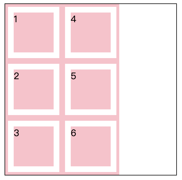
grid-auto-flow 可以改变栅格的浮动方向,默认值为 row 改为 column 之后可以沿着列的方向浮动:
1
2
3
| .container {
grid-auto-flow: column
}
|
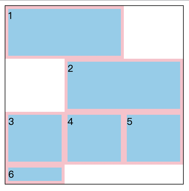
此外,grid-auto-flow 属性值的第二个值可以填写 dense 指定填充的位置修改为如果最后一个定位元素前还有空位,那就填充到其前方。
如下是不加 dense 的情况:
1
2
3
4
5
6
7
8
9
10
11
12
13
14
15
16
17
18
19
20
21
| .container {
width: 300px;
height: 300px;
border: 1px solid #000000;
display: grid;
grid-template-rows: repeat(3, 1fr);
grid-template-columns: repeat(3, 1fr);
}
.container>div {
background-color: skyblue;
border: 5px solid pink;
}
.container :nth-child(1) {
grid-column: 1/span 2;
}
.container :nth-child(2) {
grid-column: 2/span 2;
}
|
添加 dense 后:
1
2
3
4
5
6
7
8
9
10
11
12
13
14
15
16
17
18
19
20
21
22
| .container {
width: 300px;
height: 300px;
border: 1px solid #000000;
display: grid;
grid-template-rows: repeat(3, 1fr);
grid-template-columns: repeat(3, 1fr);
grid-auto-flow: row dense;
}
.container>div {
background-color: skyblue;
border: 5px solid pink;
}
.container :nth-child(1) {
grid-column: 1/span 2;
}
.container :nth-child(2) {
grid-column: 2/span 2;
}
|
如果是使用区域定位,那么区域定位元素前如果有空位,后面的元素会默认填充在前面的空位上。
11. 栅格的整体对其方式的处理 justify-content align-content
与 Flex 布局一样的是,Grid 布局也同样可以是用 justify-content 进行整体栅格的对其。
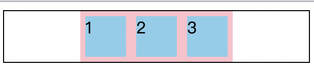
示例 1:
1
2
3
4
5
6
7
8
9
| .container {
width: 300px;
height: 50px;
border: 1px solid #000000;
display: grid;
grid-template-rows: repeat(1, 50px);
grid-template-columns: repeat(3, 50px);
justify-content: center;
}
|
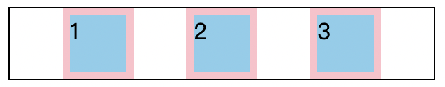
示例 2:
1
2
3
4
5
6
7
8
9
| .container {
width: 300px;
height: 50px;
border: 1px solid #000000;
display: grid;
grid-template-rows: repeat(1, 50px);
grid-template-columns: repeat(3, 50px);
justify-content: space-evenly;
}
|
此外,由于 Grid 布局是二维布局,还可以使用 align-content 来进行垂直方向上的居中对其(针对于 Flex 这种一维布局时没有垂直方向的,所以该属性在 Flex 布局中无效)。
12. 栅格内元素的整体控制 justify-items align-items
justify-items 与 align-items 在 Grid 布局中同样生效。
关于 justify-items 的效果说明:
- 在块级布局中,会将其包含的项目在其行内轴上对齐;
- 绝对定位的元素中,会将其包含的项目在其行内轴上对齐,同时考虑 top、left、bottom、right 的值;
- 表格单元中,该属性被忽略(块级元素、绝对定位元素和表格布局中对齐的更多信息);
- 弹性盒子布局中,该属性被忽略(弹性盒子中对齐的更多信息);
- 栅格布局中,会将其栅格区域内的项目在其行内轴上对齐(栅格布局中对齐的更多信息);
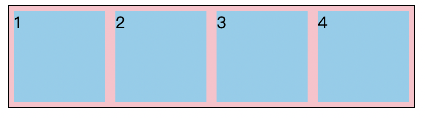
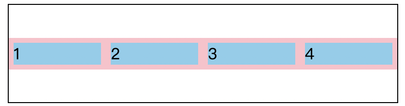
在默认情况下,justify-items 与 align-items 的默认值都是 stretch,布局内元素如果没有设置宽高将会被自动拉伸,填充至每个栅格:
1
2
3
4
5
6
7
8
9
10
11
12
13
14
| .container {
width: 400px;
height: 100px;
border: 1px solid #000000;
display: grid;
grid-template-rows: repeat(1, 100px);
grid-template-columns: repeat(4, 1fr);
align-items: stretch;
}
.container>div {
background-color: skyblue;
border: 5px solid pink;
}
|
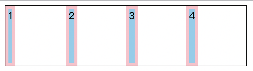
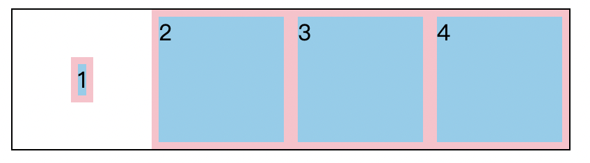
示例 1:改变 justify-items 属性
1
2
3
| .container {
justify-items: left;
}
|
示例 2:改变 align-items 属性
1
2
3
| .container{
align-items: center;
}
|
12. 栅格内单一元素对其方式的处理 align-self justify-self
除了上述对栅格内所有元素进进行统一的对其方式处理外,还可以利用 justify-self 与 align-self 进行对栅格内单一元素的对其方式的处理。如我们想要单独将第一个元素进行上下左右居中,就可以写为:
1
2
3
4
5
6
7
8
9
10
11
12
13
14
15
16
17
18
| .container {
width: 400px;
height: 100px;
border: 1px solid #000000;
display: grid;
grid-template-rows: repeat(1, 100px);
grid-template-columns: repeat(4, 1fr);
}
.container>div {
background-color: skyblue;
border: 5px solid pink;
}
.container :first-child {
align-self: center;
justify-self: center;
}
|
14. 组合简写栅格的对其方式
我们简单整理一下上面三节的整体内容:
- 对于栅格整体的对其方式,我们使用了
justify-content 与 align-content;
- 对于栅格内元素的对其方式,我们使用了
justify-items 与 align-items;
- 对于栅格内单一元素的对其方式,我们使用了
justify-self 与 align-self。
那么对于 justify-content 与 align-content 其为一组,我们可以使用 place-content 来对其进行简写,如:
1
2
3
4
| .container{
align-content: center;
justify-content: left;
}
|
相当于:
1
2
3
| .container{
place-content: center left;
}
|

对于 justify-items 与 align-items 其为一组,我们可以使用 place-items 来对其进行简写,如:
1
2
3
4
| .container{
align-items: center;
justify-items: left;
}
|
相当于:
1
2
3
| .container{
place-items: center left;
}
|

对于 justify-self 与 align-self 其为一组,我们可以使用 place-self 来对其进行简写,如:
1
2
3
4
| .container :first-child {
align-self: center;
justify-self: left;
}
|
相当于:
1
2
3
| .container :first-child {
place-self: center left;
}
|

