原理
在研究CSS选择器的时候,突然想到实现单个展开的手风琴效果很像 radio 组件,即单项选择组件,他们都是选择一个进入 selected 状态后,其他元素的 selected 状态就被取消。所以,对于表单的 radio 组件我们可以利用 CSS 伪类选择器 :selected 来检测其是否被选中。我们在 radio 旁边加一个兄弟节点作为手风琴面板展开显示的内容,默认设置为 display: none,然而当 radio 被选中后,就将其兄弟节点显示为 display: block。
同时,使用 label 标签,可以扩展 radio 组件的可选范围,使用 visibility: hidden 或者 display: none 可以隐藏原有的 input 标签样式。我们可以将 label 作为被点击对象的实例,而隐藏原有的 input,这样就可以进行美化。或者为 input 添加一个 ::after 伪类元素,也可以起到同样的效果。
具体实现
我们按照上面的设想,实现一个简单的原型:
1
2
3
4
5
6
7
8
| .content {
margin-left: 40px;
display: none;
}
input:checked+.content {
display: block;
}
|
1
2
3
4
5
6
7
8
9
10
11
12
13
14
15
16
17
18
19
20
21
22
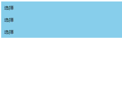
| <div>
<div class="selector">
<label for="radio-1">选择</label>
<input id="radio-1" type="radio" name="radio" value="1">
<div class="content">
这是一串内容
</div>
</div>
<div class="selector">
<label for="radio-2">选择</label>
<input id="radio-2" type="radio" name="radio" value="2">
<div class="content">
这是一串内容
</div>
</div>
<div class="selector">
<label for="radio-3">选择</label>
<input id="radio-3" type="radio" name="radio" value="3">
<div class="content">
这是一串内容
</div>
</div>
|
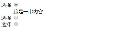
最终效果
为其添加样式与动画后:
1
2
3
4
5
6
7
8
9
10
11
12
13
14
15
16
17
18
19
20
21
22
23
24
25
26
27
28
29
30
31
32
33
34
35
36
37
38
39
40
41
42
43
44
45
46
47
48
49
50
51
52
53
54
55
56
57
58
59
60
61
62
63
64
65
66
67
68
69
70
| <!DOCTYPE html>
<html lang="en">
<head>
<meta charset="UTF-8">
<meta name="viewport" content="width=device-width, initial-scale=1.0">
<meta http-equiv="X-UA-Compatible" content="ie=edge">
<title>Document</title>
<style>
label {
display: block;
padding: 10px;
background-color: rgb(135, 206, 235);
cursor: pointer;
}
label:hover {
background-color: rgb(8, 181, 250);
}
input {
visibility: hidden;
position: absolute;
width: 0;
height: 0;
}
.content {
height: 0px;
padding: 0 10px;
background-color: pink;
overflow: hidden;
transition: all 0.2s ease;
}
input:checked+.content {
display: block;
height: 50px;
padding: 10px;
}
</style>
</head>
<body>
<div>
<div class="selector">
  <label for="radio-1">选择</label>
  <input id="radio-1" type="radio" name="radio" value="1">
  <div class="content">
    这是一串内容
  </div>
</div>
<div class="selector">
  <label for="radio-2">选择</label>
  <input id="radio-2" type="radio" name="radio" value="2">
  <div class="content">
    这是一串内容
  </div>
</div>
<div class="selector">
  <label for="radio-3">选择</label>
  <input id="radio-3" type="radio" name="radio" value="3">
  <div class="content">
    这是一串内容
  </div>
</div>
</body>
</html>
|